
Embedded Charts
What are Embedded Charts?
Embedded charts are visual representations of data that are integrated directly into software applications, websites, or other digital platforms. Unlike standalone charting tools or external visualization software, embedded charts are built into the application's interface, providing seamless access to real-time data insights within the context of the user's workflow. This integration enhances user experience by allowing users to interact with data visualizations without needing to switch between different tools or platforms.
What Are Embedded Charts Used For?
- Business Intelligence and Reporting: Embedded charts are integral to business intelligence (BI) platforms, where they help visualize key performance indicators (KPIs), track progress against targets, and monitor overall business performance. By embedding these charts directly into BI dashboards, users can quickly access and interpret data, making it easier to identify trends, spot anomalies, and make data-driven decisions.
- Financial Analysis: In the financial sector, embedded charts are used to display market trends, portfolio performance, risk assessments, and financial forecasts. They provide traders, analysts, and investors with real-time insights, helping them make quick and accurate investment decisions. These charts can be integrated into trading platforms, financial planning tools, and investment management applications.
- Sales and Marketing: Sales and marketing teams use embedded charts to track sales performance, monitor marketing campaign effectiveness, analyze customer behavior, and visualize market trends. These charts are often integrated into customer relationship management (CRM) systems, marketing automation platforms, and e-commerce websites, providing real-time insights that drive strategic planning and execution.
- Healthcare and Medical Research: Embedded charts in healthcare applications visualize patient data, treatment outcomes, and operational metrics. They help healthcare professionals make informed clinical decisions, improve patient care, and manage hospital operations efficiently. Researchers also use these charts to analyze clinical trial data, study disease patterns, and monitor public health trends.
- Project Management: Project management tools use embedded charts to visualize project timelines, resource allocation, task completion, and budget tracking. Gantt charts, burn-down charts, and other project management visuals help teams stay on schedule, manage resources effectively, and ensure project milestones are met.
- Education and E-Learning: In educational platforms, embedded charts are used to track student performance, visualize learning progress, and analyze assessment results. Educators can use these insights to tailor instruction, provide targeted support, and improve educational outcomes. E-learning platforms also use charts to track course completion rates, user engagement, and content effectiveness.
Benefits of Embedded Charts
- Enhanced User Experience: Embedded charts provide users with seamless access to visualized data directly within the application interface, reducing the need to switch between different tools or platforms.
- Improved Decision-Making: By presenting data in a visually appealing and easily interpretable format, embedded charts empower users to make informed decisions quickly and accurately.
- Increased Data Accessibility: Embedding charts within applications allows users to access relevant data and insights without requiring additional logins or access to separate analytics tools, enhancing data accessibility across the organization.
- Customization and Integration: Embedded charts can be customized to match the branding and design aesthetics of the host application, ensuring a cohesive user experience. Additionally, they can seamlessly integrate with existing workflows and processes.
- Real-Time Insights: With embedded charts pulling data directly from the application's database or API, users can access real-time or near-real-time insights, enabling timely decision-making and action.
- Self-Service Analytics: Embedded charts empower users to generate their own reports, explore data, and derive insights without relying on data analysts or IT support, fostering a culture of self-service analytics within the organization.
- Scalability and Performance: Modern embedded charting solutions are designed to handle large datasets and support multiple users simultaneously, ensuring scalability and optimal performance even as data volumes grow.
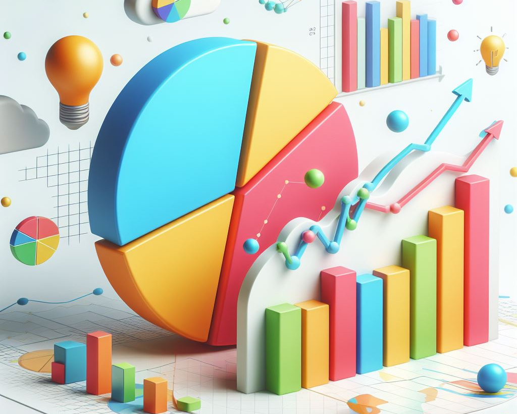
Types of Charts
- Bar Charts: Bar charts are used to compare quantities across different categories. They display data with rectangular bars, where the length of each bar represents the value. Bar charts can be oriented vertically or horizontally and are ideal for showing comparisons among discrete categories or tracking changes over time.
- Line Charts: Line charts are effective for showing trends over time. They plot data points on a graph and connect them with a line, making it easy to visualize changes and trends. Line charts are commonly used in financial analysis, performance tracking, and any scenario where understanding the trajectory of data is important.
- Pie Charts: Pie charts are circular charts divided into slices to illustrate numerical proportions. Each slice represents a category's contribution to the whole. They are useful for displaying percentage or proportional data and are often used in business presentations and reports to show parts of a whole.
- Scatter Plots: Scatter plots display data points on a two-dimensional plane, with each point representing the values of two variables. This type of chart is useful for identifying relationships, correlations, and patterns between variables. Scatter plots are frequently used in scientific research, data analysis, and exploratory data visualization.
- Area Charts: Area charts are similar to line charts but fill the area below the line with color, emphasizing the magnitude of values over time. They are useful for visualizing cumulative totals over time and can show how individual parts contribute to the whole. Area charts are often used in financial analysis and business performance tracking.
- Histograms: Histograms are used to represent the distribution of a dataset. They group data into bins or intervals and display the frequency of data points within each bin. Histograms are useful for understanding the underlying distribution and identifying patterns such as skewness, modality, and spread in the data.
- Bubble Charts: Bubble charts are a variation of scatter plots, where each data point is represented by a bubble. The size of the bubble indicates an additional variable, providing a third dimension of data. These charts are useful for visualizing multi-variable data and highlighting the relationships between three variables.
- Heatmaps: Heatmaps use color to represent data values in a matrix or table format. They are effective for showing the magnitude of data across two dimensions and identifying patterns, correlations, and anomalies. Heatmaps are commonly used in data analysis, user behavior tracking, and geographic data visualization.
How to Choose the Right Chart Type
- Understand Your Data:
- Nature of Data: Determine whether your data is categorical, numerical, or a combination of both.
- Data Relationships: Identify if you need to show comparisons, distributions, trends, or relationships.
- Define Your Objective:
- Comparison: If you need to compare different sets of data, consider bar charts, column charts, or radar charts.
- Trend Analysis: For showing trends over time, line charts or area charts are effective.
- Distribution: To display the distribution of data, use histograms or box plots.
- Proportion: Pie charts or donut charts are useful for showing parts of a whole.
- Audience and Context:
- Technical Expertise: Tailor your chart choice to the technical understanding of your audience. Simpler charts like bar or line charts are often more accessible.
- Presentation Context: Consider where and how the data will be presented – in a report, a presentation, or an interactive dashboard.
- Data Volume:
- Small Datasets: For smaller datasets, simple charts like bar, line, or pie charts can effectively convey the message.
- Large Datasets: For larger datasets, consider using scatter plots, heatmaps, or bubble charts to manage the complexity and provide clarity.
- Visual Clarity:
- Avoid Clutter: Choose charts that do not clutter the visualization space. Overloading a chart with too much information can confuse the audience.
- Highlight Key Insights: Use chart types that allow you to highlight the most important aspects of your data.
- Interactivity:
- Static vs. Interactive: Decide if your chart needs to be static or interactive. Interactive charts, such as those in dashboards, can provide additional insights through user interactions.
Conclusion: Leveraging Chart Types with EnqDB
Selecting the right chart type is pivotal for effective data storytelling. By understanding your data, defining your objective, and considering your audience, you can choose the chart that best conveys your insights. EnqDB helps you integrate a variety of chart types into your analytics, ensuring that your data is presented clearly and effectively. Explore how EnqDB's customer-facing analytics can transform your data visualization strategy, providing the tools you need to make informed decisions.
While EnqDB specializes in customer-facing analytics rather than embedded BI, the principles remain the same. Just as embedded BI solutions seamlessly integrate analytics into business applications, EnqDB empowers businesses to deliver personalized analytics experiences to their customers through conversational interfaces. By leveraging EnqDB's natural language capabilities, organizations can enable their users to interact with data intuitively, driving user engagement and facilitating data-driven decision-making.